Screens are very cheap now – as cheap as making complex mechanical items like speedometers and rev counters which is why more and more vehicle manufacturers are moving away from these heavy traditional items in the instrument panel, and towards having one or more screens which can be configured in a design that can convey lots of different types of information, depending on the requirements at that immediate time.
The instrument panel is the area right in front of the driver which has typically displayed the speed, engine revolutions, engine temperature and fuel tank level. Some of these aren’t really relevant for everyday motoring any more: if your car’s electronics prevents you from exceeding the rev limiter, do you need to see the number of revs? Do you need to see the actual temperature of the car in a gauge or just a warning light if it exceeds the recommend temperature? Do you need to see the battery power? Some of these items were more relevant when cars were much more mechanical and likely to break down; now they’re driven by microprocessors and even if they do, there’s little you can do about it.
That provides other opportunities, though: the rise of the custom interface. As well as the necessary metrics such as speed, today’s cars have a wealth of information they can display on a screen to help the driver manage the options in the car:
- Engine settings – some cars have modes which give more power, or modify the throttle and gearbox response
- Suspension settings – some cars have suspension that’s adjusted magnetically to create a firmer or softer ride
- Steering settings – with drive-by-wire steering there’s no longer a steering column, and the steering weight and gearing can be changed electronically
- Smartphone integration and apps – many new phones sync directly using Siri Eyes Free, Apple CarPlay, etc, or if they don’t go that far, they connect via Bluetooth for streaming
- Vehicle setup and preferences – anything from how long the internal lights stay on to audio warnings for exceeding a certain speed limit
- Satellite navigation and traffic warnings
- Media selection – radio, auxiliary, CD, Bluetooth, iPod, wireless, memory card and more
- Trip computer – fuel economy, distance travelled, distance remaining in the tank, etc
- Tyre pressure, water level, oil temperature and other vehicle metrics
- Interior and exterior temperature
- What gear you are in, or the driving mode (e.g. sport vs eco)
- Whether you are driving economically based on a set of parameters defined by the manufacturer
- Camera views – some vehicles have several cameras – rear, front and one on each wing mirror.
The display of digital screens is very flexible, but information must be presented in a way that is readable to the driver without being too distracting from the road. Designers of these interfaces have had to learn kinetic typography to create interfaces that draw the viewers eye to the most important part of the information at the right time.
Drivers must have a choice of what to display at what time. When screens change it is often animation of the interface elements and text which gives a clue as to what to look at. Text can respond to inputs from a joystick, jog wheel, track pad or buttons to give more visual clues.
Skeuomorphic designs will give way to new types of interface designs
Skeuomorphic design – design that looks similar to the original mechanical items it’s replacing – was the obvious first step in replicating the interfaces because people need to feel comfortable using these new systems without having too much cognitive load. These designs are ones that originally came from limitations in mechanical engineering (e.g. a circular speedometer because the needle described a circular path). Over time, interface standards will develop as more and more testing reveals the best way to display the necessary data.
There is plenty of space to display information in a car: a head-up display which is projected onto the windscreen, an instrumental panel behind the steering wheel, and a dashboard screen in the centre of the dashboard. It might be that in the future, screens become bigger to display more information more elegantly, or they might shrink in some vehicles which have autonomous features where the driver doesn’t need to know or control as much, or they might become an extension of a smartphone whereby the smartphone takes over some of the display requirements.
Let’s look at a fairly modern car (2015 Toyota GT86) which hasn’t kept up with the times in terms of screens in the instrument panel, but has acquiesced to what looks like an aftermarket multimedia system, albeit basic, in the dashboard.
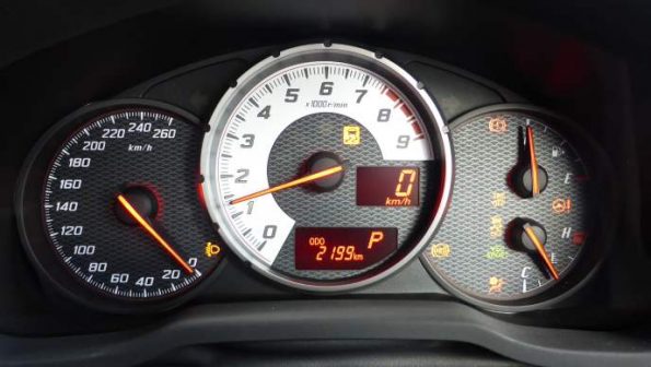
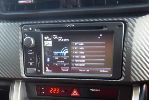
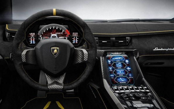
At the other end of the scale let’s look at a Lamborghini Centenario with a full screen behind the wheel and a large screen in the dashboard with multiple interface types.
In terms of cars that are more accessible to the everyman, this is from a 2016 Audi A4 TDI. The interface is skeuomorphic – it looks like a conventional rev counter and speedometer.
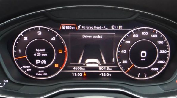
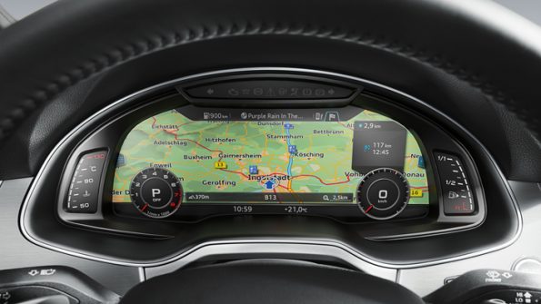
But, it changes to become a full navigation screen (amongst other things) in the Audi Virtual Cockpit.
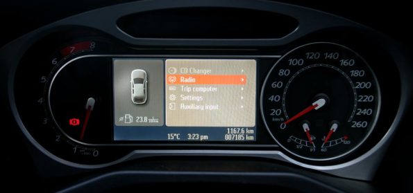
Designs that need to show a lot of text, like this from the Ford Mondeo XR5, need to have more movement in the interface and text.
For a full demo of the Audi Virtual Cockpit, check out this video
